
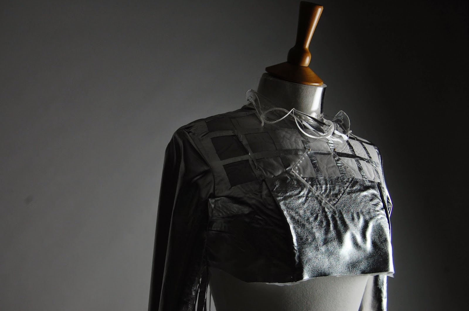
I have finally taken professional shots of my mock up so far, and I think these pictures somehow mesmerizing reflect the metropolis theme, specifically the city during the night. The silver fabric reflects glowing holographic light, as does the acrylic detail; signifying the city lights. The cut through is not finished, however it adds structure and emphasises the influence from the large grid building.
I'm really glad i made this mock up because it made me realise what elements did not work out in this design idea. For example, the tassels do not flow the way i intended it to, amd therefore I hall have to eliminate the use of the spray paint and fins an alternative method. Furthermore, the fabric creases excessively due to the delicate texture, and therefore I need to find a different but similar fabric that will be easier to work with. Also, my cut through needs a lot of fixing because it's so untidy and cut poorly.
I have insane amounts of improvements to make to this garment, however I think the use of acrylic for the collar and necklace is amazing because it adds architectural texture/influence, furthermore i love the use of sleeves to the top.
As a result, I'll be redesigning my final garment, and plan to avoid all the weaknesses and keep the strengths. I plan to research further into my influences and find more relevant artists to see how i can change and improve my final garment.


No comments:
Post a Comment